Research
Business Goals
Meetings with stakeholders proved that the significant business goal was to increase the profit margin to 500% by improving customer Retention and Conversion.
User Goals
Users aim to seamlessly buy or sell frequently consumed internet services like Airtime, Internet, Electricity, Pay Cable TV, Sports Betting, Ticketing and other virtual services
Define
Themes and Pattern
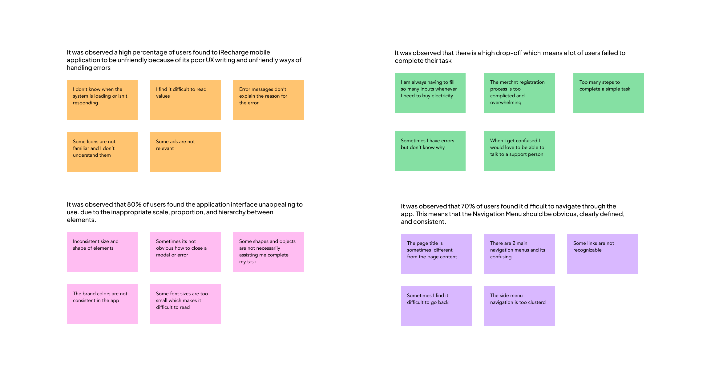
Affinity mapping was used to synthesize research data in other identify Patterns and Themes
- It was observed that 70% of users found it difficult to navigate through the app. This means that the Navigation Menu should be obvious, clearly defined, and consistent.
- It was observed that 80% of users found the application interface unappealing to use. due to the inappropriate scale, proportion, and hierarchy between elements.
- It was observed a high percentage of users found to iRecharge mobile application to be unfriendly because of its poor UX writing and unfriendly ways of handling errors
Insights
Here are major Insights generated based on themes and patterns
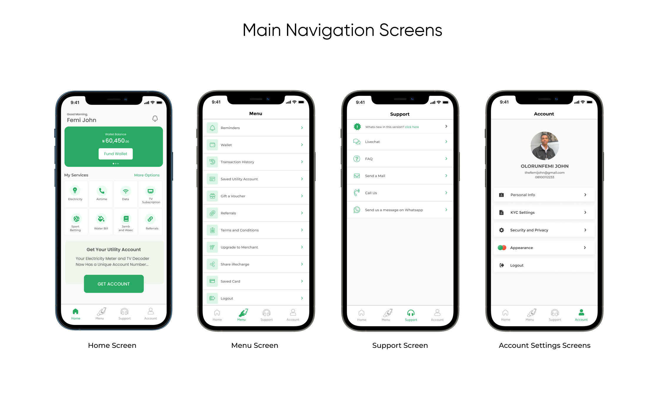
- Based on the theme that users found it difficult to navigate through the application, the insight is to create a consistent and easy means of navigation that users can understand
- Based on the theme that many users find the application unappealing to use the insight is to properly make use of design principles of visual elements like scale, proportion, and hierarchy to properly organize elements on the screen
- Based on the theme that many users find the application unfriendly to use. insight is the UX writing tone should be more friendly and interactive to help the user understand the situation at all times.
Ideate
Ideate
Wireframes & Low-Fidelity Prototype
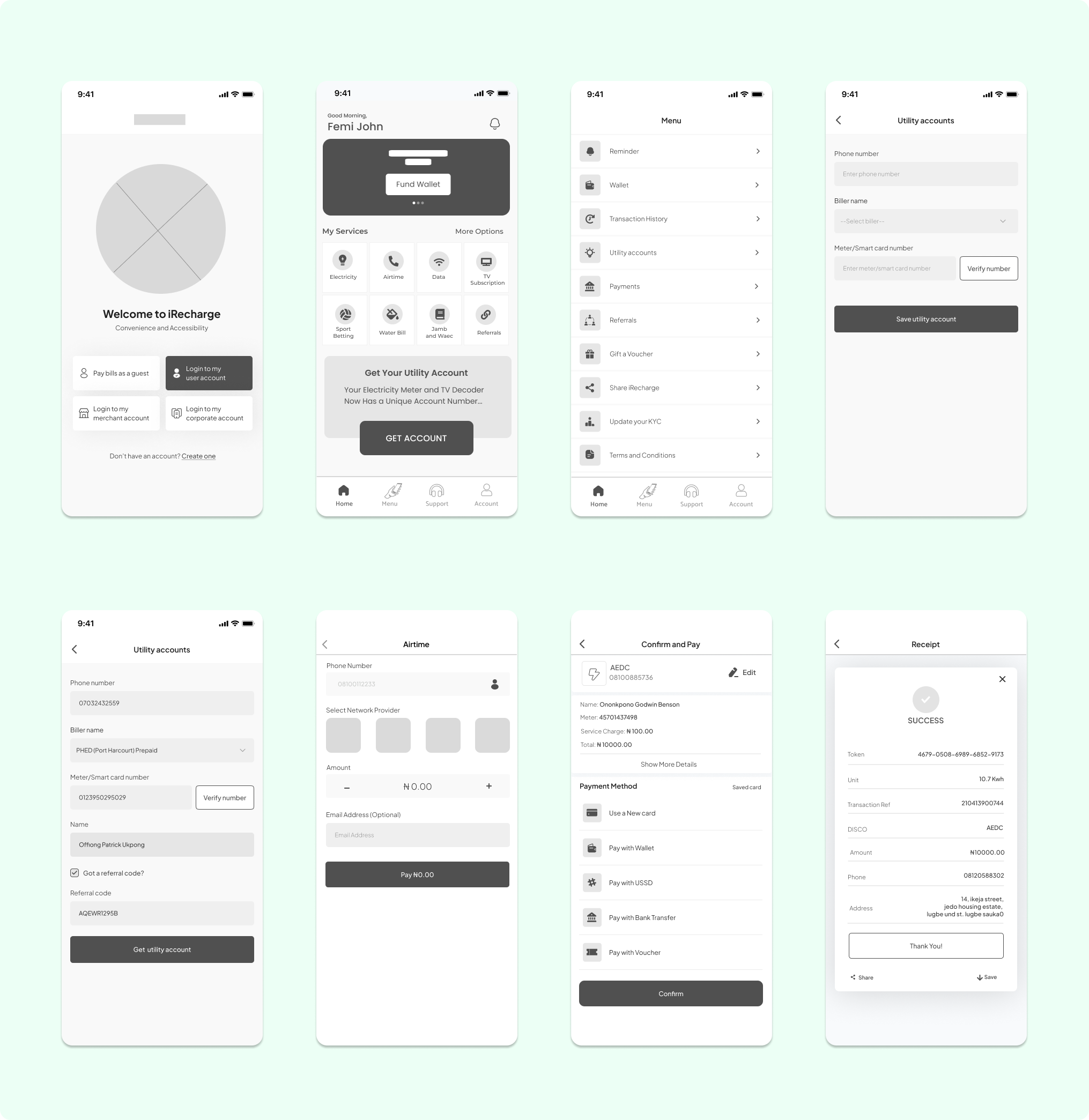
After getting insights and defining the user flows, I began creating wireframes that are proposed to solve the identified challenges. these wireframes were reviewed and made into a low-fidelity prototype.
Ideating for new Feature
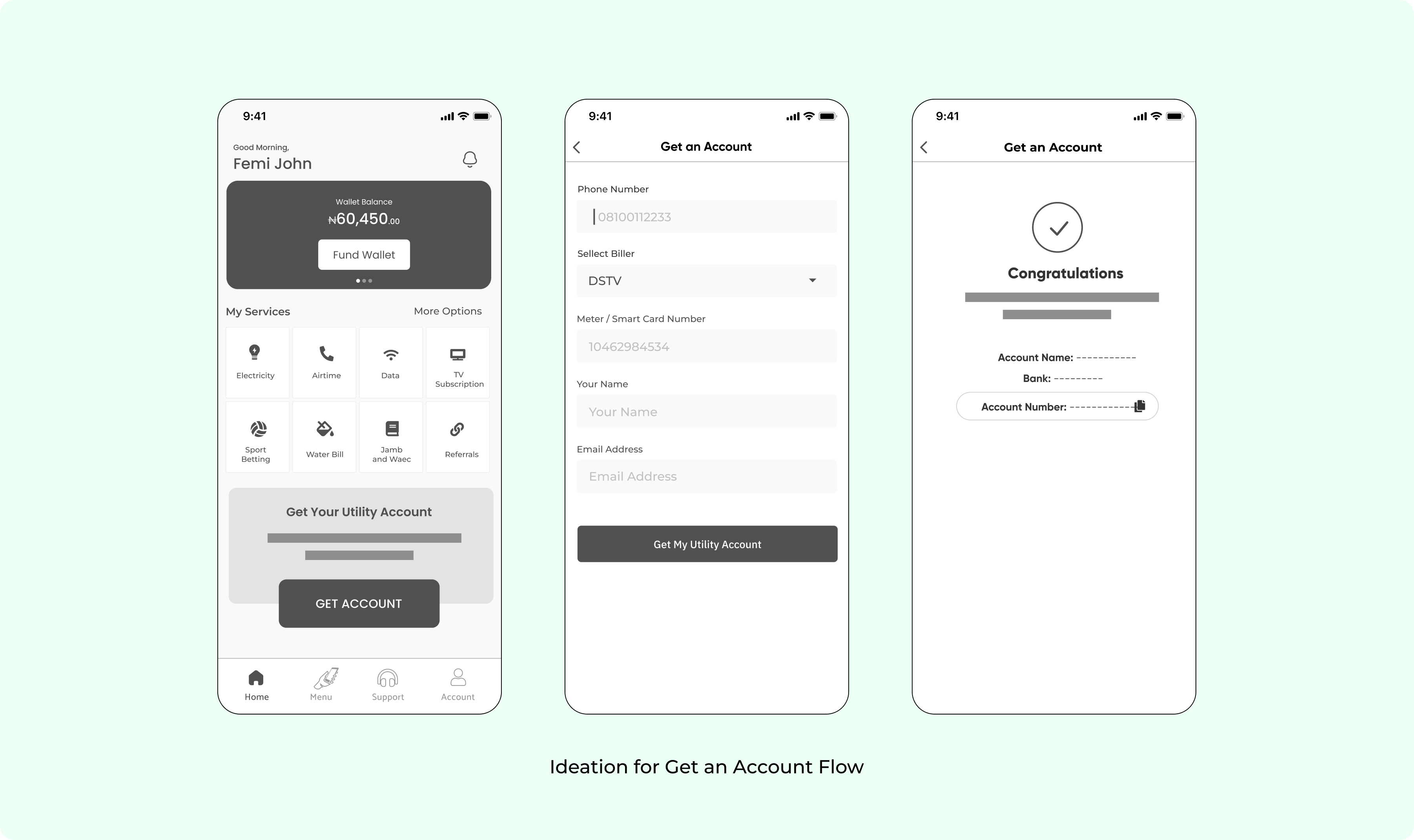
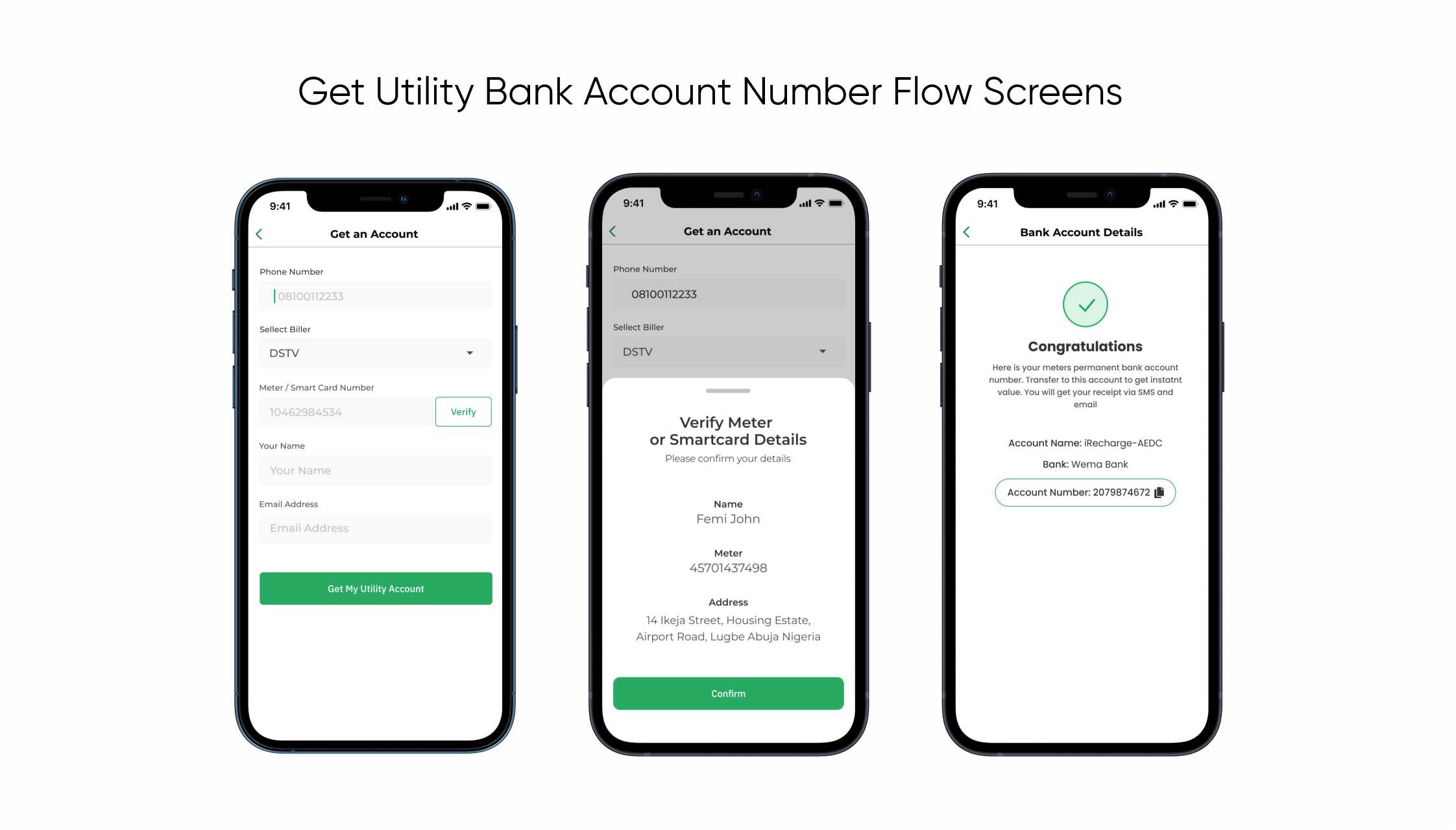
A New Feature Called "1 Bank Transfer"
This new feature enables users to pair their meter number or Decoder Smart card number with a bank account number. Once a transfer of the purchase value is made to the assigned account number, the customer receives instant value with an SMS receipt.
This new feature saves the user the hassle of having to fill a purchase for every recurrent bill payment. the introduction of this feature will also have an impact on the flow of purchases electricity services on the iRecharge Application.
Prototype and Test
Iterative Usability Test on Low-Fidelity Prototypes
After getting insights and defining the user flows, I began creating wireframes that are proposed to solve the identified challenges. these wireframes were reviewed and made into a low-fidelity prototype.
Usability Test
The goal is to Identify how successful users can complete major tasks and the ease of use of the new interface design.
Key Performance indicators to identify process pain points during user test:
- How long and easy does it take to sign up as a merchant?
- How easy is it to pay a bill on the application?
- How easy is it to sell services on the platform?
- What can there be any parts of the application users get stuck on?
Prototype and Test
Iterative Usability Test on Low-Fidelity Prototypes
After getting insights and defining the user flows, I began creating wireframes that are proposed to solve the identified challenges. these wireframes were reviewed and made into a low-fidelity prototype.
Style Guide
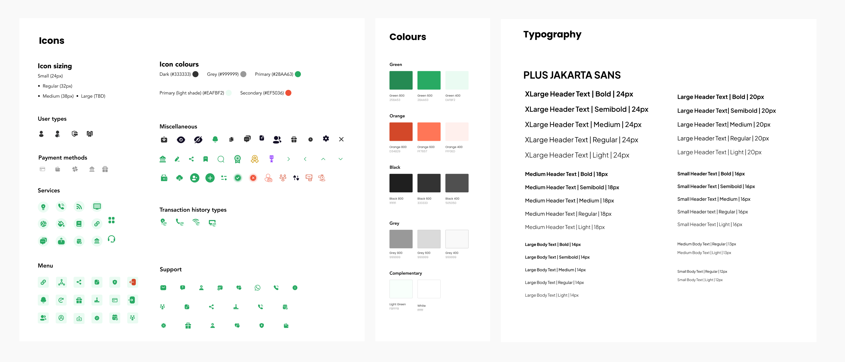
Style Guide, Brand ID, and Components for mockups and High-Fidelity Prototype.
Style Guide
Style Guide, Brand ID, and Components for mockups and High-Fidelity Prototype.


